Found this at Architects at work ...
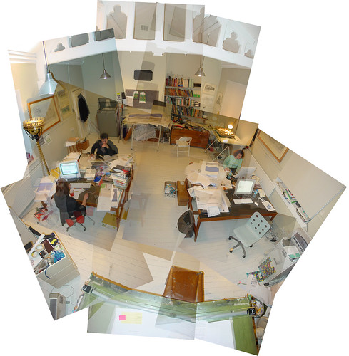 |
| architects office 2006 |
Over Easter we stayed in an apartment that wasn't exactly to-die-for architecture... probably built in the 90's... nevertheless designed to be a (remarkably) comfortable space. We felt instantly at home. The (third floor) front door opened onto a breezeway patio with a dining setting that overlooked the pool and garden. After passing through this "outdoor room" you came to sliding glass doors that opened right out to make the living space much larger and wonderfully airy. Curiously, whilst not being the most stunning place Ive ever stayed it was certainly one of the most comfortable, airy and well designed!
So what is it that makes architecture work?
That apartment was a reminder to me of unexpected plusses ... the fact that it takes being in a space sometimes to see how it works.
By the way ... I did get my camera out on the weekend, went bike riding, swimming... generally had a wonderful time. Came home Monday night and next day, despite starting off with an enthusiastic early morning bike ride I spent yesterday in bed ... quite unwell... seems ages since I was confined to bed. Still a little shaky today.... so haven't downloaded my pics yet.
Found a few architecture blogs/sites to share instead of my own pics...
Fantastic Journal has a lot of leads to excellent blogs on architecture and more. Fantastic Journal is a blog about "architecture, design and other things too. It is written by Charles Holland who is an architect and a director of FAT."
This post on the urban picturesque (click to read)caught my eye at Fantastic Journal.
 |
| (Image; Allotment holders on Clapham Common, 1940. Via) |
text from post:
Our cities are growing. Growing, that is, in the horticultural sense. Recent years have seen a minor infestation of urban gardens and inner city allotments, typified by MUF's recently openedDalston Barn (formerly Dalston Mill) and Union Street Urban Orchard on London's South Bank. What both these projects have in common, along with a certain ad-hoc, DIY charm, is a desire to invert urban/rural distinctions and bring aspects of the countryside into the city.
The gently anarchic quality of both - along with the concept of urban farming and guerrilla gardening generally - represents a curious fusion of contemporary concerns with deliberately rustic and antiquated imagery. An understandable suspicion of global agribusiness and a desire to find more sustainable methods of food production has manifested itself in re-enactments of street parties, village fetes and rural festivals. More here.
 |
 |
| (Image: Garden built out of a bomb crater, London, 1940's. Via) |
Archiblog is a portal for blogs about architecture .... they cover other laguages besides English... so there's a lot of exploring .
Bad British Architecture is a blog for the curious.

This building is the reason we started this blog. Absolute drivel, posing as contextual housing. The inexplicable symmetry, accentuated by black plastic extracts and downpipes; timber cladding that is varnished so hideously that it no longer looks like wood; 'balconies' that are not balconies (the three bonsai shrubs behind the top balcony in the middle are a heartbreaking expression of what the residents really wanted); regulation beige brick; the mud borders showing how money ran out before the landscaping was finished.
The building replaces a pub called the Venture Inn, which faced this square in West Knowle. Housing developers and local authorities care not a toss for social spaces like pubs and corner shops. They'd rather have flats full of junior management consultants than communities.
The inn's replacement is the architectural equivalent of porridge. Bland, formless, cloying, does nothing more than fill a hole. Text: Bad British Architecture Blog
IN a somewhat similar vein from www.slab-mag.com:
Modern Façades Today Now #003
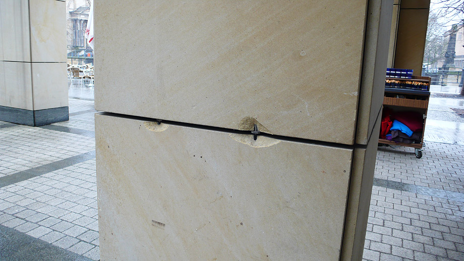
This has to be the architectural equivalent of a split fingernail. And if that’s the case then the whole of Berlin could do with a damned good manicure because this kind of thing can be seen city-wide. Gah! It makes my nostrils curl up at the edges just looking at it.
The dinked column in question is part of a structure aping the peristyle of Roman architecture and belongs to a building with the sphincter-clenchingly horrid name of “SpreePalais”, meaning that it’s a palace on the river Spree. Geographically speaking, the name is not in dispute, but a palace? Getouttahere. Historically, the peristyle surrounded a lush courtyard with a fountain, but at SpreePalais, architects Nägele, Hofmann, Tiedemann & Partner have cleverly used it to enclose a draughty sandstone quarry where exiled office workers are required to smoke.
→ Part of the “Modern Façades Today, Now” Collection
Ive always liked visiting BLDGBLOG for its completely awe-inspiring reach of thinking around the man made world.
I found this image below at the post: Earthquake Sounds, Tsunami Rocks, Future Trenches.
 |
| [Image: Photo by Ko Sasaki, courtesy of the New York Times]. |
1) "This webpage contains earthquake 'sounds' created from seismic recordings around the world generated by the 2011/03/11 Mw9.0 Tohoku, Japan earthquake. They provide a unique way for us to listen to the vibration of the Earth that is otherwise inaudible to us, and to decipher the complicated earthquake physics and triggering processes."
2) "The stone tablet has stood on this forested hillside since before they were born, but the villagers have faithfully obeyed the stark warning carved on its weathered face: 'Do not build your homes below this point!' Residents say this injunction from their ancestors kept their tiny village of 11 households safely out of reach of the deadly tsunami last month that wiped out hundreds of miles of Japanese coast and rose to record heights near here. The waves stopped just 300 feet below the stone... Hundreds of so-called tsunami stones, some more than six centuries old, dot the coast of Japan, silent testimony to the past destruction that these lethal waves have frequented upon this earthquake-prone nation."
3) "Europe may be starting to dive under Africa, creating a new subduction zone and potentially increasing the earthquake risk in the western Mediterranean Sea... For millions of years the African plate, which contains part of the Mediterranean seabed, has been moving northward toward the Eurasian Plate at a rate of about an inch every 2.5 years (a centimeter a year). Now studies of recent earthquakes in the region indicate that a new subduction zone may be forming where the plates are colliding along the coasts of Algeria and northern Sicily... [M]ost established subduction zones are marked by giant undersea trenches. A similar trench should eventually form in the Mediterranean—but certainly not overnight." TEXT: BLDGBLOG
Then take a quick look at partner site: Edible Geography where I really liked this post The Mutato Archive
 |
IMAGE: Mutatoes by Uli Westphal. |
"Since 2006, artist Uli Westphal has been collecting, documenting, and eating Berlin’s Mutatoes—the non-standard fruits, roots, and vegetables that can be found at the city’s farmers’ markets. His photographs form an archive of “these last survivors of agricultural diversity,” revealing an incredible variety of colours, curves, and contours.
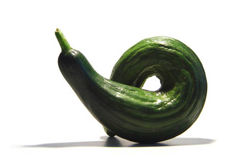 |
IMAGE: Mutatoes by Uli Westphal. |
 |
IMAGE: Mutatoes by Uli Westphal. |
For Westphal, these Mutatoes bear witness to “the suppression of mutation and polymorphism in our industrial food system.”
The complete absence of botanical anomalies in our supermarkets has caused us to regard the consistency of produce presented there as natural. Produce has become a highly designed, monotonous product. We have forgotten, and in many cases never experienced, the way fruits, roots, and vegetables can actually look (and taste).
I first came across Westphal’s photographs thanks to a reader comment on “The Fruit Standard,” a post I wrote on the one-year anniversary of the partial repeal of the European Union’s fruit and vegetable standards. Text: Nicola Twilley
From the same source a post on the Architecture of Opium Production is fascinating reading. This gives you a taste of that post!
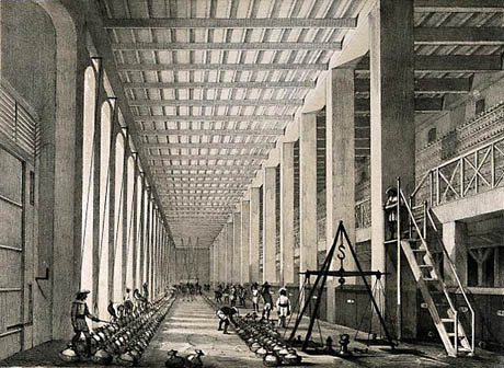 |
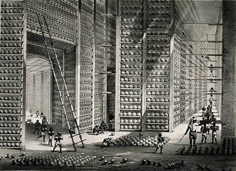
These colour lithographs were originally made in 1850 at the request of Walter S. Sherwill, an army officer who served as a British “boundary commissioner” in Bengal. According to Ptak Science Books, these particular reproductions were taken from an article exploring the economic and infrastructural marvels of the Indian opium trade in an 1882 supplement to Scientific American.
They show the main opium receiving, production, and distribution center of the East India Company in Patna, a town in the north-western Bihar province of India. From these vast mixing rooms and examining halls, the Company claimed to produce roughly 13,000,000 pounds of opium annually, which was then shipped down the Ganges to Calcutta, and from there to China.
The image above shows the Examining Hall of the opium factory, where, Scientific American reports, “the consistency of the crude opium as brought from the country in earthen pans is simply tested, either by the touch, or by thrusting a scoop into the mass. A sample from each pot (the pots being numbered and labelled) is further examined for consistency and purity in the chemical test room.”
 |
| The stacking room |
Here's a post from GOOD design:
Mini-Project-Find Your Dream Home
 |
Did you hear about this (very rich) guy in India who just built a $1 billion house? It's 27 stories tall and has room for 160 cars. We're not sure that's our ideal living environment, but it did get us thinking: What is our dream home? What is your dream home?
You might be interested in living in an iconic piece of architecture likeFrank Lloyd Wright's famous Fallingwater house. Maybe you want to live in a house from the movies. Maybe you want something super-efficient like that awesome, tiny 24-room Hong Kong apartment. Or maybe you want some really crazy retro-futuristic thing, like the one above. Your options are limited only by your dreams.
Here's one from South Australia that is both a house and bridge.
 |
| Architect Max Pritchard |
HOUSE or bridge? Actually, it's both. The amazing construction above, which spans a creek near Strathalbyn, is just one example of extraordinary new South Australian architecture.
Built last year, it is the product of a fertile mind - award-winning Adelaide architect Max Pritchard.
Mr Pritchard said the site - a creek nestled among river red gums, dense wattles and rocky banks - called for an innovative approach.
"Most of my clients come to me with a site and have me do something to suit - each commission is unique," he said.
The owners of the house - who asked to remain anonymous - said that they were initially surprised by Mr Pritchard's proposal. Although the design of the house was relatively simple, the fact that it straddled a creek was sure to raise eyebrows.
And the house is, indeed, built like a bridge, sitting on struts that extend from four solid foundations on either side of the creek.
 |
 |
Here's the 'Rolling Cube' house from Shane Hendriks:
 |
Chris Watkins with his Copper house at Mt Osmond:
 |
 |
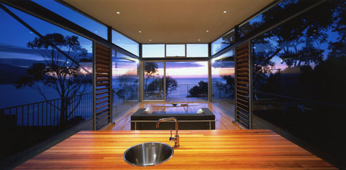
Here's one from Tasmania, the island state below mainland Australia by architect Stuart Tanner.
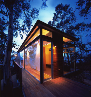 |
For architect Stuart Tanner, growing up in Tasmania—surfing, diving, and bushwalking through the Australian state’s many rainforests—has given him a love of the land and has strongly influenced his architecture. The Pirates Bay House, a small coastal retreat the Tasmanian-based architect designed near Eaglehawk Neck on Tasmania’s Tasman Peninsula, reflects his awe. “Ultimately, anything you build here is engulfed by the landscape,” he says. “I’m completely humbled by it.”

Id better finish with this one... Kangaroo Valley House...by Alexander Michael ... starting with this interior... a bathroom... love these taps, basin and the whole look!

So thats it for me ... back to my other tasks and then to some photo downloads before long I hope.... gotta see what my modest little camera has to offer... I did find the manual/extra bits Id lost ... so thats a start!


Id better finish with this one... Kangaroo Valley House...by Alexander Michael ... starting with this interior... a bathroom... love these taps, basin and the whole look!
 |
 |
 |
 |

So thats it for me ... back to my other tasks and then to some photo downloads before long I hope.... gotta see what my modest little camera has to offer... I did find the manual/extra bits Id lost ... so thats a start!

4 comments:
i am so grateful for these links, miss munns. makes my morning to go browsing in the imaginary imaginations...
n♥
Hello Woolf...
delighted you found your way over here for a browse... must admit I was still feeling woozie when I started the post... but the nourishment for the imagination has made me feel a whole light brighter!
S
What fun Sophie, thank you for all the thoughts and the links! I was raised by an architect, my dad loved Modernism and passed the love on.I love the Tasmanian house here. How interesting it is that a house is really part of an organic system and 'lives' and changes depending on its relationship with the enviroment it is in. Have a lovely day-
ah... interesting to have an architect father Annamaria ...that could be quite formative I imagine...
When I was around 13, 14 I would sit for hours and draw plans for houses... and thought of doing architecture over art... dont think it would have suited me... but interesting how the interest lingers... and with you....
thanks for leaving your thoughts,
S
Post a Comment